


Building a responsive website is essential in today's digital landscape. This blog will guide you through the process of creating a complete multi-page website using HTML and CSS. By the end, you will have a fully functional and visually appealing website that adapts seamlessly to different screen sizes.
Overview of the Website Design 📊
We'll be creating a website that includes various sections, such as a navigation bar, course offerings, testimonials, and a contact form. The design will be clean, modern, and responsive, allowing users to navigate effortlessly on both desktop and mobile devices.

Setting Up Your Project Folder 📁
First, you need to set up your project folder. Create a folder that contains the following:
- An images folder to store all images used in the website.
- An index.html file for the main webpage.
- A style.css file for styling the website.
Make sure to download and place any images you want to use in the images folder. You can find the images in a zip file linked in the resources section.
Creating the HTML Structure 🏗️
Now, let's dive into the HTML file. Open your index.html file and add the basic HTML structure:
<!DOCTYPE html>
<html lang="en">
<head>
    <meta charset="UTF-8">
    <meta name="viewport" content="width=device-width, initial-scale=1.0">
    <link rel="stylesheet" href="style.css">
    <title>University Website Design</title>
</head>
<body>
    <!-- Content will go here -->
</body>
</html>
Next, we will create the navigation bar and header section. This will include a logo and menu links for easy navigation.
Building the Navigation Bar and Header Section 🖥️
In the body of your HTML, add the following code to create the navigation bar:
<nav>
    <div class="logo"><img src="images/logo.png" alt="Logo"></div>
    <div class="nav-links">
        <ul>
            <li><a href="#home">Home</a></li>
            <li><a href="#about">About</a></li>
            <li><a href="#courses">Courses</a></li>
            <li><a href="#blog">Blog</a></li>
            <li><a href="#contact">Contact</a></li>
        </ul>
    </div>
</nav>
This code creates a navigation bar with a logo on the left and menu links on the right. Now let's style it in the CSS file.
Styling the Navigation Bar with CSS 🎨
Open your style.css file and add the following styles:
nav {
    display: flex;
    justify-content: space-between;
    align-items: center;
    padding: 20px;
    background-color: #333;
}

.logo img {
    width: 150px;
}

.nav-links ul {
    list-style: none;
    display: flex;
}

.nav-links li {
    margin: 0 15px;
}

.nav-links a {
    color: white;
    text-decoration: none;
    font-size: 16px;
}

.nav-links a:hover {
    text-decoration: underline;
}
These styles give the navigation bar a modern look and feel. The hover effect enhances user experience.
Creating the Hero Section with a Call to Action 📣
After the navigation bar, let's create a hero section that includes a title and a call-to-action button:
<header class="hero">
    <div class="text-box">
        <h1>World's Biggest University</h1>
        <p>Join us to explore various courses and programs.</p>
        <a href="#courses" class="hero-btn">Visit Us</a>
    </div>
</header>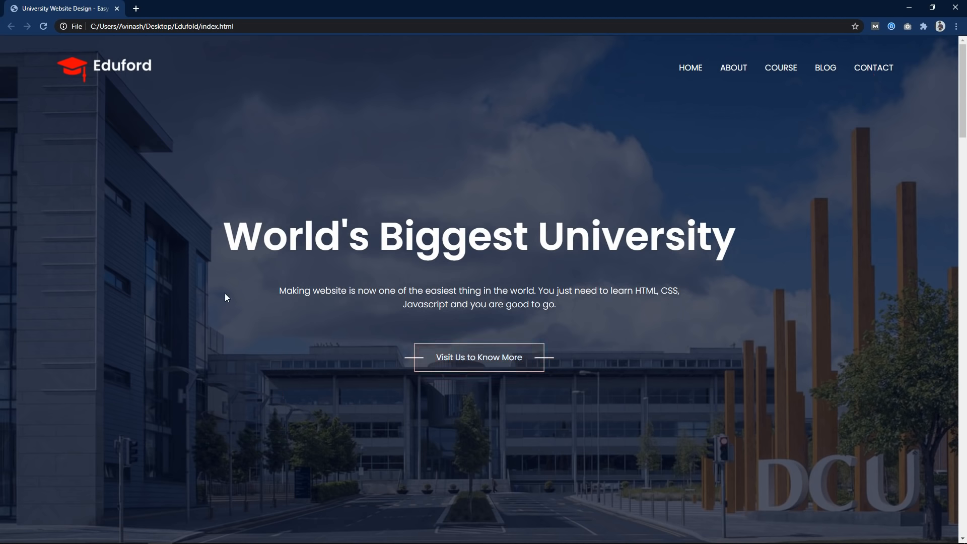
This section includes a title, a brief description, and a button that links to the courses section.
Styling the Hero Section 🌈
In your CSS file, add styles for the hero section:
.hero {
    background-image: url('images/banner.png');
    height: 600px;
    display: flex;
    justify-content: center;
    align-items: center;
    color: white;
    text-align: center;
}

.text-box {
    max-width: 600px;
}

.hero-btn {
    padding: 10px 20px;
    background-color: #ff5722;
    color: white;
    text-decoration: none;
    border-radius: 5px;
}

.hero-btn:hover {
    background-color: #e64a19;
}
This CSS gives a vibrant look to the hero section with a background image and styled button.
Adding Course Offerings Section 📚
Next, we will create a section to showcase the courses offered:
<section id="courses">
    <h2>Courses We Offer</h2>
    <p>Explore our wide range of courses designed for your needs.</p>
    <div class="course-row">
        <div class="course-column">
            <h3>Intermediate</h3>
            <p>Learn advanced topics in your chosen field.</p>
        </div>
        <div class="course-column">
            <h3>Degree</h3>
            <p>Earn a degree in various disciplines.</p>
        </div>
        <div class="course-column">
            <h3>Post Graduation</h3>
            <p>Specialize in your area of interest.</p>
        </div>
    </div>
</section>
This section features three columns, each representing a different course level.
Styling the Courses Section 🎓
Now, add styles for the courses section in your CSS file:
#courses {
    padding: 50px 0;
    text-align: center;
}

.course-row {
    display: flex;
    justify-content: space-around;
    margin-top: 30px;
}

.course-column {
    flex-basis: 30%;
    background-color: #f0f0f0;
    padding: 20px;
    border-radius: 10px;
    transition: box-shadow 0.3s ease;
}

.course-column:hover {
    box-shadow: 0 4px 20px rgba(0, 0, 0, 0.2);
}
The courses section is now visually appealing with a hover effect on the course cards.
Creating the Testimonials Section 🗣️
Next, we will add a testimonials section to display reviews from students:
<section id="testimonials">
    <h2>What Our Students Say</h2>
    <div class="testimonial-row">
        <div class="testimonial-column">
            <img src="images/user1.jpg" alt="User 1">
            <p>"The courses are well structured and informative!"</p>
            <h3>John Doe</h3>
        </div>
        <div class="testimonial-column">
            <img src="images/user2.png" alt="User 2">
            <p>"I gained valuable knowledge that helped me advance in my career!"</p>
            <h3>Jane Smith</h3>
        </div>
    </div>
</section>
This section presents user feedback and enhances credibility.
Styling the Testimonials Section ⭐
Add the following styles to your CSS file:
#testimonials {
    padding: 50px 0;
    text-align: center;
}

.testimonial-row {
    display: flex;
    justify-content: space-around;
}

.testimonial-column {
    flex-basis: 45%;
    background-color: #f8f8f8;
    padding: 20px;
    border-radius: 10px;
    margin: 10px;
}

.testimonial-column img {
    width: 80px;
    border-radius: 50%;
    margin-bottom: 10px;
}
This styling gives a neat appearance to the testimonials section.
Implementing the Contact Section 📞
Finally, let's create a contact section with a form to reach out:
<section id="contact">
    <h2>Contact Us</h2>
    <form>
        <label for="name">Name:</label>
        <input type="text" id="name" required>
        <label for="email">Email:</label>
        <input type="email" id="email" required>
        <label for="message">Message:</label>
        <textarea id="message" required></textarea>
        <button type="submit">Send Message</button>
    </form>
</section>
This form allows users to send inquiries directly from the website.
Styling the Contact Section ✉️
In your CSS file, add styles for the contact section:
#contact {
    padding: 50px 0;
    text-align: center;
}

form {
    display: inline-block;
    text-align: left;
    margin-top: 20px;
}

label {
    display: block;
    margin: 10px 0 5px;
}

input, textarea {
    width: 300px;
    padding: 10px;
    margin-bottom: 15px;
    border: 1px solid #ccc;
    border-radius: 5px;
}

button {
    padding: 10px 20px;
    background-color: #ff5722;
    color: white;
    border: none;
    border-radius: 5px;
    cursor: pointer;
}

button:hover {
    background-color: #e64a19;
}
This styling makes the contact form user-friendly and visually appealing.
Making the Website Responsive 📱
To ensure that our website looks great on all devices, we will implement media queries in the CSS file:
@media (max-width: 700px) {
    .course-row, .testimonial-row {
        flex-direction: column;
        align-items: center;
    }

    nav {
        flex-direction: column;
    }

    .nav-links ul {
        flex-direction: column;
    }
}
This media query adjusts the layout for screens smaller than 700 pixels.
Uploading Your Website to a Server 🌍
Once your website is ready, you can upload it to a web server. This allows users to access it online. You can use hosting services like Afeeshost.com for reliable hosting solutions.
Conclusion 🎉
Congratulations! You've successfully created a fully responsive multi-page website using HTML and CSS. With this foundation, you can continue to expand and enhance your site. Don't forget to test your website on different devices to ensure a seamless user experience.
If you found this tutorial helpful, please consider subscribing to my Channel for more web development tutorials. Thank you for reading!
